Ancient cave paintings in France show the earliest form of sports took place over 15,000 years ago. Since then, sports have evolved into the organized fashion we practice today.
From teams to sporting good companies, logos represent an organization in a unique and creative way beyond just a name.
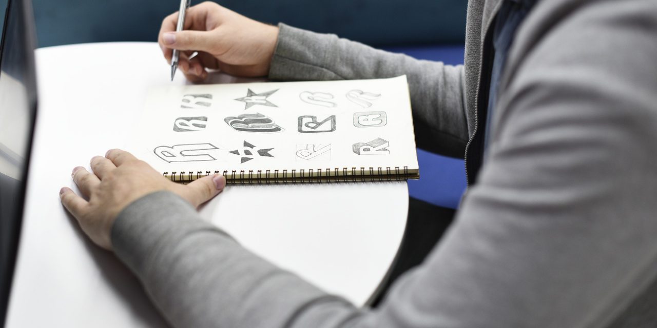
Crafting a sport logo doesn’t have to be complicated. Keep reading for five ideas to help you design that perfect emblem.
- Less Is More
Keep in mind a sport logo is the first impression most spectators will perceive about your team. It can be tempting to make a vibrant, detailed design, but the reality is many of the best logos aren’t the fanciest.
In fact, having a logo too busy or crowded can be off-putting and harsh on the eyes. Shoe brands such as Nike and Adidas have ran with this concept by featuring logos any of us could perfect on scrap paper.
Do leave enough room to incorporate text in your logo whether it’s a team name, location, or both. Sometimes a logo won’t call for this if the design tells the story.
- Complement Colors
Any sports team or company should have a defining color, ideally at least two.
Purple and brown may be your favorite colors, but that doesn’t mean they go well together on paper. A sport logo’s colors should complement each other with a natural look.
Classic examples include blue and white, red and orange, or black and silver. You can also explore other colors in the same family to give off a contrasting look, such as navy and sky blue.
- Hometown Embracement
The most memorable sport logos go beyond featuring a mascot. Think of ways you can incorporate a team or brand’s town of origin into a logo. This is a great way to pay tribute to your team’s roots.
Iconic examples of sports logos and names are the NBA’s Golden State Warriors featuring the Golden Gate Bridge or the skyline silhouette depicted in the New York Mets’ MLB logo.
- Symmetry Is Key
A sports logo design is meant to express uniformity and independence from similar organizations. No one expects it to look like Michelangelo’s work, but the logo should avoid being lopsided, especially on the front of apparel.
Software programs like Adobe Spark Post are great for creating professional logos with templates that allow you to add custom photos or font for a personal touch.
- Alternate Logos
Your design doesn’t have to be limited to just one team logo design. While a primary sport logo should feature all of the important details, smaller features can be used as a subsidiary logo.
Many teams place this on the shoulder patch of a jersey or headwear. It’s a great way to add style and establish more of an identity. This design should be small and simple.
Creating the Perfect Sport Logo
Just like participating in sports, the goal of designing a sport logo should be fun. Don’t be discouraged if it’s not perfect the first time or takes a few tries.
Also, ask for input. Everyone on the team or part of the organization should have an opportunity to provide suggestions or ideas. A lot of times this is how the greatest logos come to fruition.
Are you interested in publishing your own sports articles about your favorite teams? Join Sports Media 101 to learn about our opportunities.